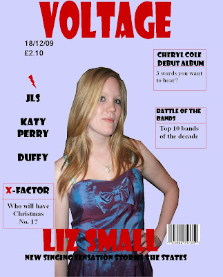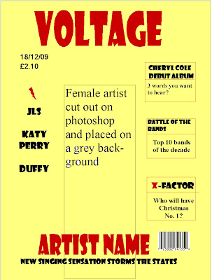
Friday, 18 December 2009
Thursday, 17 December 2009
Monday, 14 December 2009
Friday, 11 December 2009
Tuesday, 8 December 2009
Monday, 7 December 2009
Wednesday, 18 November 2009
Conventions of an NME contents page
 The contents page typically uses a pale background that's pale grey with red, white and black text. The contents page uses red because it's a powerful and intense colour and it uses white and black because they contrast well and stand out of the grey background. The image isn't actually of a person but the building is being represented as magestic because the camera is tilted up at it which links in with the headline, 'Our photo tribute to three decades of gigs at one of the world's greatest music venues'. The magazine has an ideology where music is important. A piece of media language that shows this is the 'Band Index' on the left side of the page which shows that there is a lot of music featured in the magazine. There are five different sections on the right side of the page that show what the magazine is split into. The other contents page shows that the headlines stay the same every week which creates continuity.
 There's one main image on the contents page of Ricky from the Kaiser Chiefs and a reference to what page the interview is. The main image take up about 2/3 of the page but there's a box along the bottom and down the right side of the page taking up the rest of the space.
Conventions of Radar's double Page Spread


On both of the pages blue is a dominant colour which is obviously to do with the magazine's colourscheme, 'Radar'. On the top one the background is still plain although it's blue rather than the typical, white, black or grey. The background on the other one is white bu the background of the main image is of a bedroom to imply that the article will go into the artist's personal life, 'Need to Know: The Teenagers'.
On both spreads the artists are represented in different ways. On the first one they're being represented as confident and stylish by their pose and costumes whereas in the bottom one the artists are being represented as relaxed and chilled out because of the setting their in, the bedroom, their costumes, informal T-shirts and jeans, and their layed back pose. The text on both only takes up a quarter of the space which is typical of double page spreads and on the bottom one two pictures are used rather than one. The audience of the magazine are probably a younger generation whose into fresh artists and bands. The ideology of the magazine is new music. An item of media language that shows this is the article on the new band, 'Mini Viva'.
Comparing the Conventions of a Double Page Spread

 The text on the double page is only 1/4 of the space. 3/4 is the picture. The headline, 'Will He Won't He?' is the same colour as the main artists clothes which creates continuity throughout the page.
The font is black against a white background so that it's easily readable and it's an interview with the band.
Only one image is used and there is a constant colour scheme. The band is being represented as confident in the picture as they're looking directly into the camera. They're also being represented as sophisticated because of the costumes they're wearing.
The ideology of the magazine is style and image. A feature of media language that shows this is the main image were each member of the band is wearing a sophisticated and stylish costume. The audience is probably quite young because Black Eyed Peas aren't a really old band.
Monday, 16 November 2009
Conventions of Q Contents Page
 The contents page uses a plain background so that the reader's eyes isn't drawn from the main image. It uses mainly three colours, white, red and black except for the picture which are the colours typically used on the cover of a music magazine.
The contents page helps reinforce the reader by showing the context of the magazine therefore it reinforces the ideology and reflects a typical front cover.
The contents page has one large image and one smaller one at the bottom of the page advertising a review.
The ideology of Q is obviously music enthusiasts who like a diverse range of music. An element of media language that shows this is the main image of the band Oasis.
Typical Headlines
'Christina Aguilera - The Dirty Girl Fights Back' - Rolling Stone
'Taylor Swift - Country Teen Queen Takes Her Music Global' - Billboard
'Johnny Cash - The Untold Story' - Uncut
'The Beatles' - Uncut
'Anthony Kiedis - SEX (LOTS!), DRUGS (NOT!) AND MAN SKIRTS' - Blender
'Katy Perry - Kiss 'N' Tell With Pop's Bi-Curious Babe' - Blender
'R.E.M. - Ressurected' - Spin
'Duffy - A Pop Soul Sensation' - Spin
'The Jonas Brothers - God! Girls! Guitars!' - Rolling Stone
'Taylor Swift - Secrets Of A Good Girl' - Rolling Stone
'Kraftwerk - Rebuilt and Rebooted' - Mojo
'The Beatles - The Album that Shocked The World' - Mojo
'Slipknot - Somebody's Gonna Get Killed...' - Kerrang
'Madonna - Stupid Question! Next!' - Q
'Morrissey - The Mozfather Back At His Shocking Best' - NME
All of the headlines have the artist that features in the main image's name followed by a catchy tagline that sometimes uses illitaration or a pun, 'God! Girls! Guitars!'
Magazine names
Uncut
Blender
Spin
Rolling Stone
Paste
The Wire
Mojo
Kerrang
Q
NME
Rocksound
The Word
Possible names:
Crunch
Fourty
Season
Demand
Cube
Voltage
Tune
Zone
Fate
Trace
Friday, 13 November 2009
Prices + Frequency
Kerrang - Cover price: 2.20. Frequency: 51 issues per year
Mojo - Cover price: 4.50 Frequency: 12 issues per year
NME - Cover price: 2.10 Frequency: 51 issues per year
The Word - Cover price: 4.80 Frequency: 12 issues per year
Uncut - Cover price: 4.20. Frequency: 12 issues per year
Rock Sound - Cover price: 3.80 Frequency: 13 issues per year
Prices range between £2.10 - £4.80 and are either issued every month or once a week. The magazines that are issued monthly are more expensive than the weekly magazines. I would issue my magazine once a week at either £2.10 or £2.20 so that people can afford it as pop music is mainly aimed at younger people that might not or only just be financhially independent so they can't afford to spend £5 on a magazine.
Covers for Magazines that Feature Pop


Top Pop Music Magazines
Thursday, 12 November 2009
Research on Main Image of Music Magazines

Conventions of Uncut


Wednesday, 11 November 2009
Conventions of Blender


Blender has an audience who is probably young and enthusiastic about music as it features modern artists and also advertises downloads. Its audience includes people who like general music as Blender ranges from dance and hip-hop to rock, alternative and R&B. Blender is also known for it's pictorials of female celebrities.
Both magazines have bland backgrounds. One is white whilst the other one is grey. This means that all the attentions is on the main image and the subheadings are easy to read. On both covers 'Blender' is covered by the main image which shows that it is a well established magazine because people don't need to see the name to know what it is.
Blender has an ideology where a diverse range of music is important. A piece of media language that shows this are the two main pictures on both front covers. Both of the artists are completely different to each other which shows that Blender includes interviews with diverse artists.
Conventions of Spin magazine


Tuesday, 10 November 2009
Conventions of Rolling Stone


Conventions of Paste


Conventions of the Wire
 The Wire has an ideology where music from the 'outer limit' is important. An example of media language that shows this is the colour scheme that the magazine uses. There is little colour and is mainly, grey black and white on all of the covers. The audience of the wire are music enthuasts who are mainly into avant rock, breakbeat, jazz, modern classic and electronica.
In only one of the covers are the artists featuring in the main image looking at the camera. The other covers main images, all include the artist looking away from the camera which represents them as rebellic and out of the ordinary because typically on the front cover of a music magazine the main image is of the artist looking into the camera.
Since 2003 the Wire, as an institution, has run a radio station as well as making and publishing magazines independantly.
Monday, 9 November 2009
Conventions of Mojo


Conventions of Kerrang


Conventions of Q magazine


List of Music Magazines
Magazine includes information on music, videos, books, movies, fanzine reviews, upcoming release listings, music charts, more.

- Billboard
News, current charts, artist information, and more from well known music magazine.

- Fly
UK music magazine covering dance, jazz, hip hop, and jungle. Offers loads of features, reviews, club info, and more.
http://www.world-newspapers.com/music.html
For More magazines


